
Mobile-Friendly vs. Mobile-Designed: Does the difference really make a difference?
So you finally decided to add a mobile website to your marketing arsenal?
Considering that by 2014 the installed base of devices based on lightweight mobile operating systems is predicted to exceed the total installed base of all PC-based systems – good decision!
Now you have another decision to make – mobile-friendly or mobile-designed?
This is a question we hear more and more. So, let’s clear up the issue now.
See the difference.
Using your smartphone, go to a NicheLabs-designed mobile site called www.BayviewDentalArts.com. That’s a mobile-designed site. If you click on the desktop link at the bottom of screen, you’ll be on the mobile-friendly version of the site.
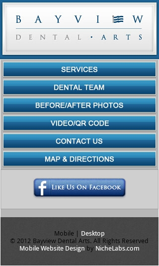
Mobile designed
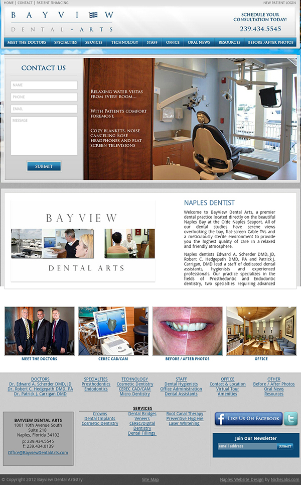
Mobile friendly
Mobile-friendly
A mobile-friendly site displays pretty much the same way on both your desktop and a mobile device. In other words, whether someone views your website on a computer (desktop or laptop) or a mobile device, such as a smartphone or tablet, the content is the same.
A mobile-friendly website will function normally as a desktop website. On a smartphone, its content will be smaller, and it may not have full functionality on a touchscreen tablet.
A mobile-friendly website is an economical compromise: While you lose some functionality on mobile devices, your desktop version works normally and will look the same, more or less, on mobile devices.
What makes it mobile-friendly is that it gives people on the go the information they need:
- Ways for them to contact you on the spot, such as your actual phone number, physical address and email address.
- Slideshows that work without Adobe Flash, which is not supported by Apple mobile devices.
- Smaller-size images that will load fast on mobile devices that don’t have high-speed data transmission.
Mobile-designed
Also called mobile-optimized, the premise here is that people who access your mobile site are most likely standing in a store trying to make a purchase or driving down a street trying to find your location. A mobile-optimized site is designed for users who wants fast, easy access to very basic information.
A mobile-designed website uses advanced technology to reformat a website when viewed on a mobile device to show only certain parts of the main site – basically, only what busy people on the go need:
- Actual contact info
- Simplified navigation with large touch points
- Reduced graphics to make essential data easier to access
- The option for users to view the desktop version of the site
So, does the difference make a difference?
We say yes. A mobile-designed website is ultimately more user-friendly to someone on the go than a mobile-friendly site.
Which is right for you?
At Atlanta website design firm NicheLabs, we are designing more and more mobile-designed sites for our clients. If you have questions about going mobile, please email us at sales@nichelabs.com or call 866.413.7952.