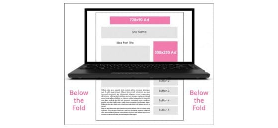
Below the Fold Has Disappeared
With a quarter of the year passing by, if you haven’t thought about changing the design of your website to roll with the trends, now may be a good time to start! What’s old is new and what was new is old. Traveling back in time, about ten years ago, websites were in the business of efficient user flow and access of information. Looking back, we then only had one device in mind. The evolution of smart phones has gradually turned our strategy from one dimensional to three.
In 2006 a study by Jakob Nielsen found that 77% of visitors to a website do not scroll, and therefore only see the portion of the website that is above the fold. This theory my friends, is now challenged by the development of smart phones and tablets. The increase in use of smartphones to view the internet surpassed pc usage in January of 2014 for the first time in history! This served as a major wake-up call for designers. Why, you may ask would it effect website designs? Being that websites are now designed for mobile viewing and other devices, the functional usage of these devices must now be considered.
The “Scroll”
Scrolling down a webpage was a definite no-interest in most user studies back in 2006. This is why the “above the fold” strategy was adopted in pc web design from print. It was suggested that the most compelling and majority of content be placed above the fold, i.e. before a user needed to start scrolling down. With the scrolling function being necessary when viewing mobile content, users are now becoming acclimated and use to scrolling as a natural behavior. With touch screen and app functionalities requiring the “swipe”, scrolling is now an adapted behavior for users.
Test Test Test
Testing your user experience success is always a good way to tailor and change your website. Beginning the re-design process takes much thought, data, and testing. Consider your users and the devices that you would like to optimize your website functionality for, and go to the drawing board. While you are there, be open to the “scroll” as a useful design functionality blue print. As mobile devices become more popular, it’s becoming more commonplace for sites to opt for scrolling instead of linking as a means to display content, especially on their home pages. It is easier for users to simply scroll through a page to get their information than it is to constantly click to find information.
If you have questions or want to learn more, please contact NicheLabs at 888-978-9254 or Sales@NicheLabs.com!